This Site
Jun-Aug 2020
front-end
creative
process
What I learned
- How to layout a website with a focus on user experience.
- How to write HTML, CSS, and JavaScript.
- How to succinctly showcase my work.
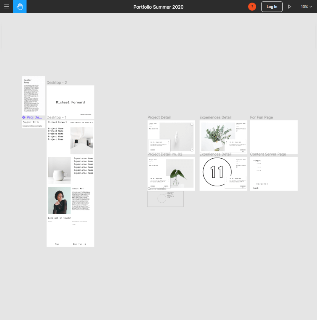

Im. 01, figma_wireframe
Based on learnings from my previous site, I found that making a wireframe to prove out design concepts in an easily changeable method would make for a quick design cycle. I spent around a week fine tuning the design, testing static pages, and collecting assets before diving into the final site. Using the Figma wireframe to test minor CSS changes proved invaluable during the development process.
Im. 02, task_tracking
Another cornerstone of the design process was accurately identifying and cataloging design changes and solutions. Each time I worked on the site, I would first reference this “TODO” document and add or remove tasks as needed. I am continuing to refine and update this site, and hope to keep it as a living representation of my work!
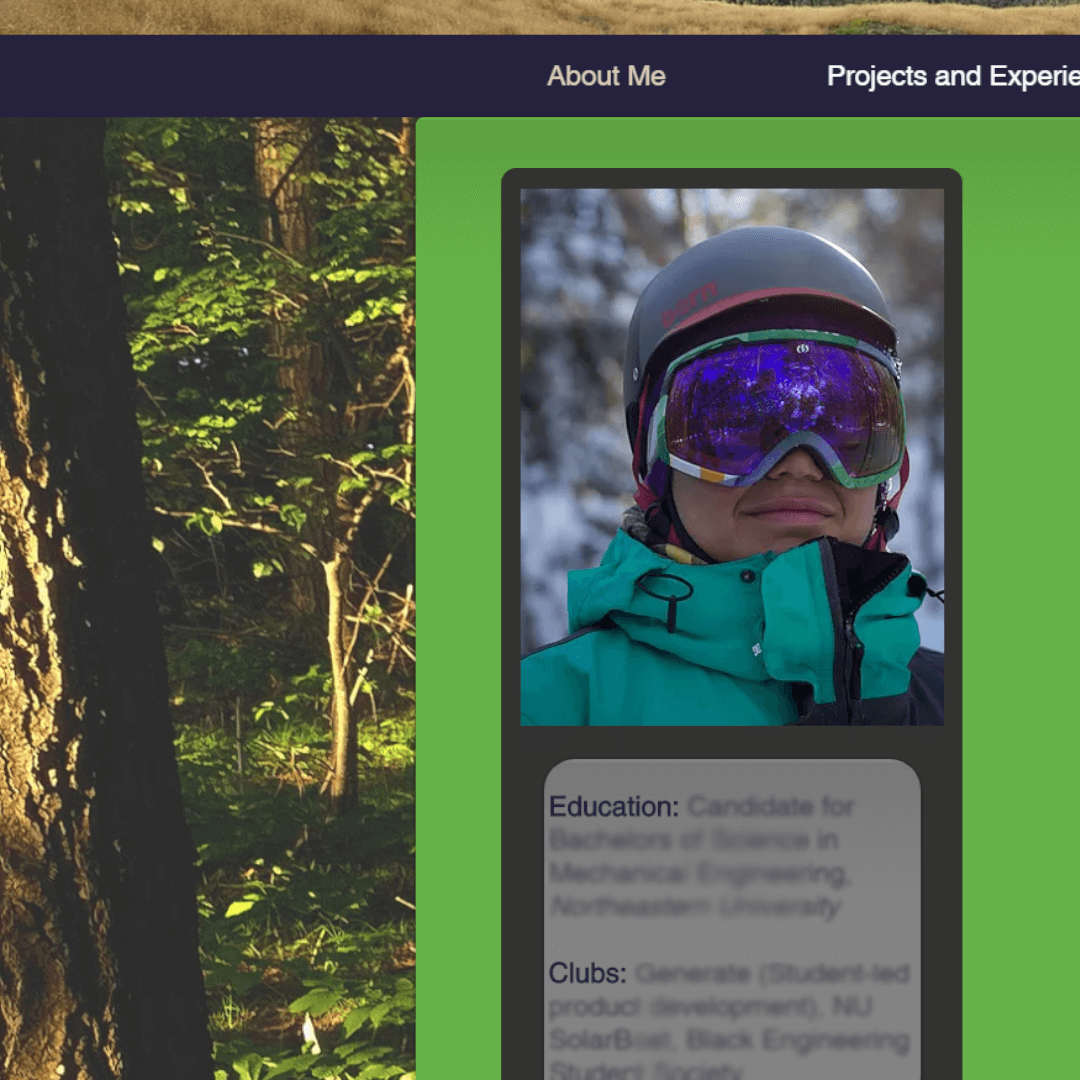
Im. 03, first_site
My first portfolio site was made using a site builder which meant I could basically design it without any forethought. As you can see, that site was far too noisy and was unintuitive. On rebuild, I decided to spend more time upfront clearly defining the visual style of the website, which I think lent to a cleaner, more user centered experience.
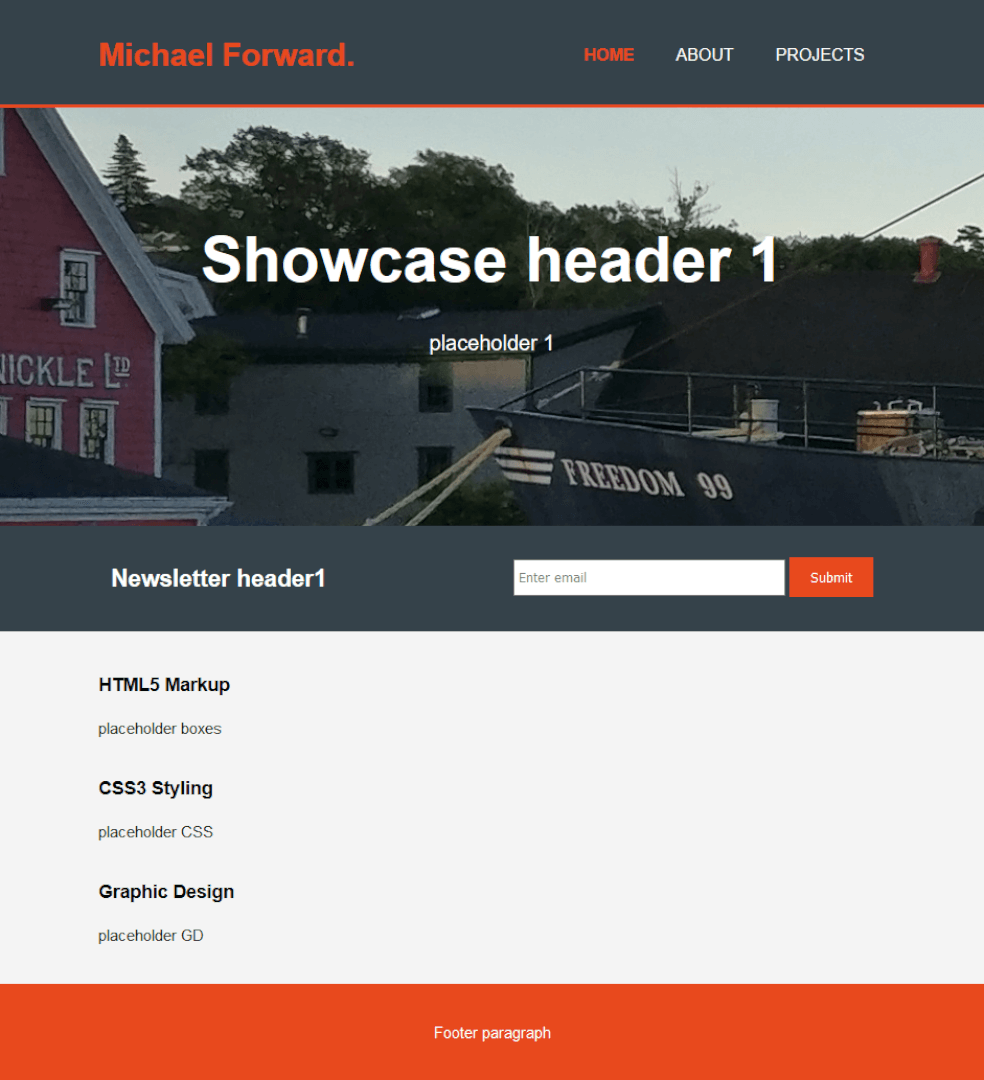
Im. 04, first_code
Taking the plunge from site builder to self-coded had its hiccups. This was the initial layout for my first self-built portfolio, which I started in mid 2018. I followed a video to layout the major blocks, and as a result lacked a deeper understanding of the code. On rebuild, a substantial amount of time was spent learning the fundamentals of HTML, CSS, and JavaScript to ultimately create a stronger site.
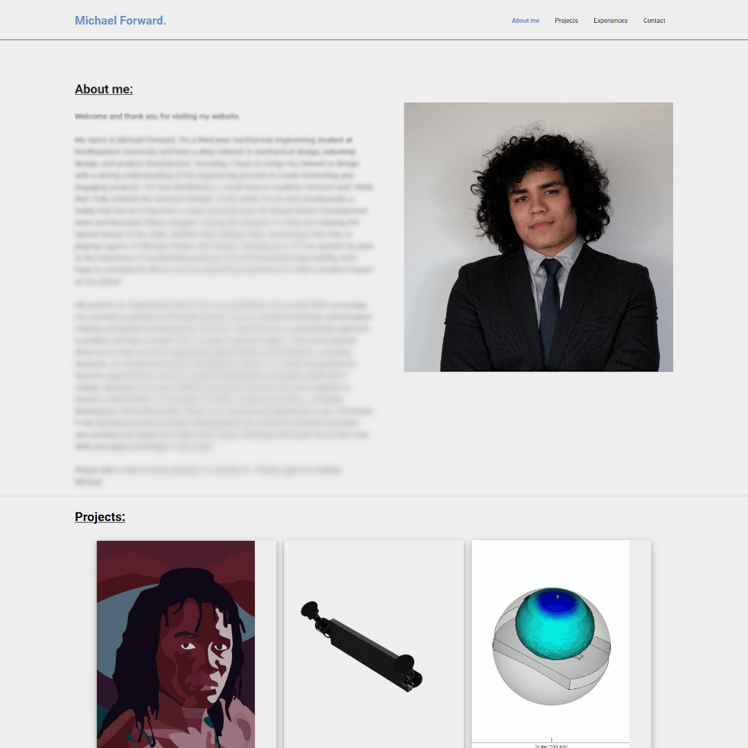
Im. 05, portfolio_mk1
After spending more time familiarizing myself with the syntax of HTML and CSS I was able to create a site that I was proud of. Many of the lessons learned from creating the site had a strong influence on the current iteration of my portfolio.
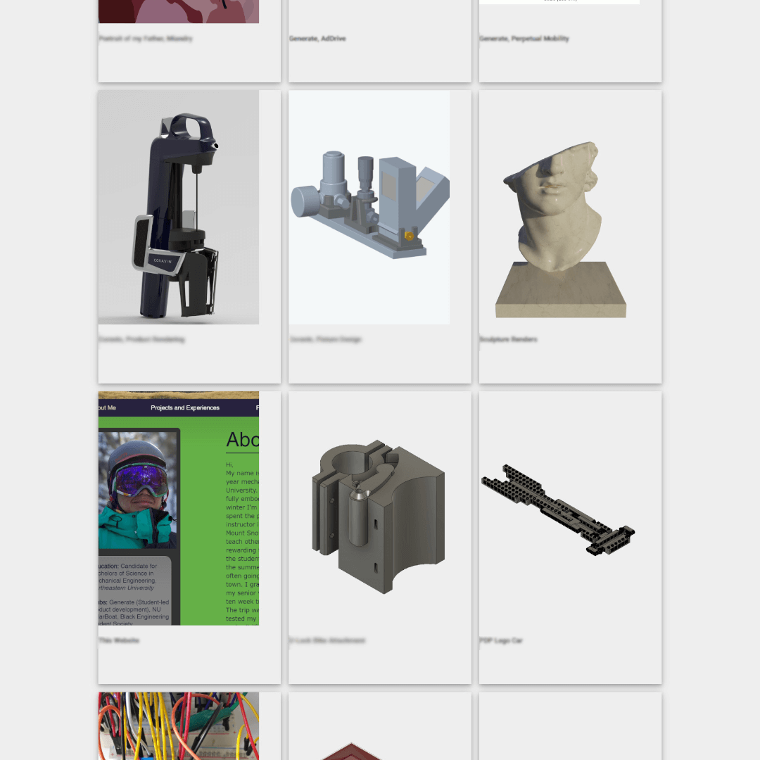
Im. 06, mk1_projects
A particular area I liked was the strong showcase of my projects. Evolving this concept to an updating image field allowed for a design that I feel was more striking. With an expanding text field associated with each project I could give a little more information on the project before clicking on it.
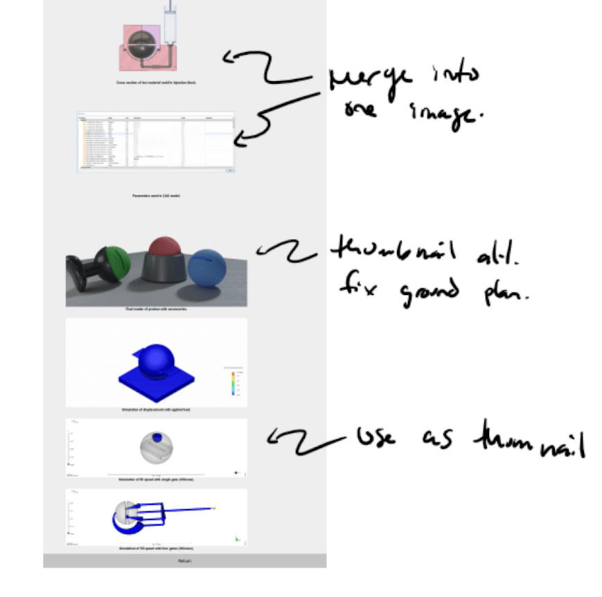
Im. 07, mk1_markup
One issue in the previous site was content without context. For each page I took notes on what I wanted to keep, cut, or modify. Take a look at “Generate, Perpetual Mobility” to see how I implemented these comments.