Coravin Product Rendering
Jun-Dec 2018
co-op
consumer product
product rendering
keyshot 7
What I learned
- Understanding company needs.
- Understanding user perception.
- Product visualization.
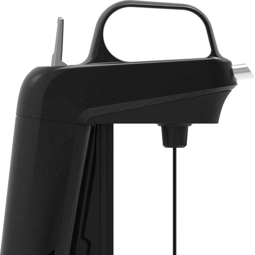
Im. 01, model_two_spout
The Coravin Model Two is a staple in the Coravin product line, so when it came time for a product refresh I was really excited to have the opportunity to work on it.
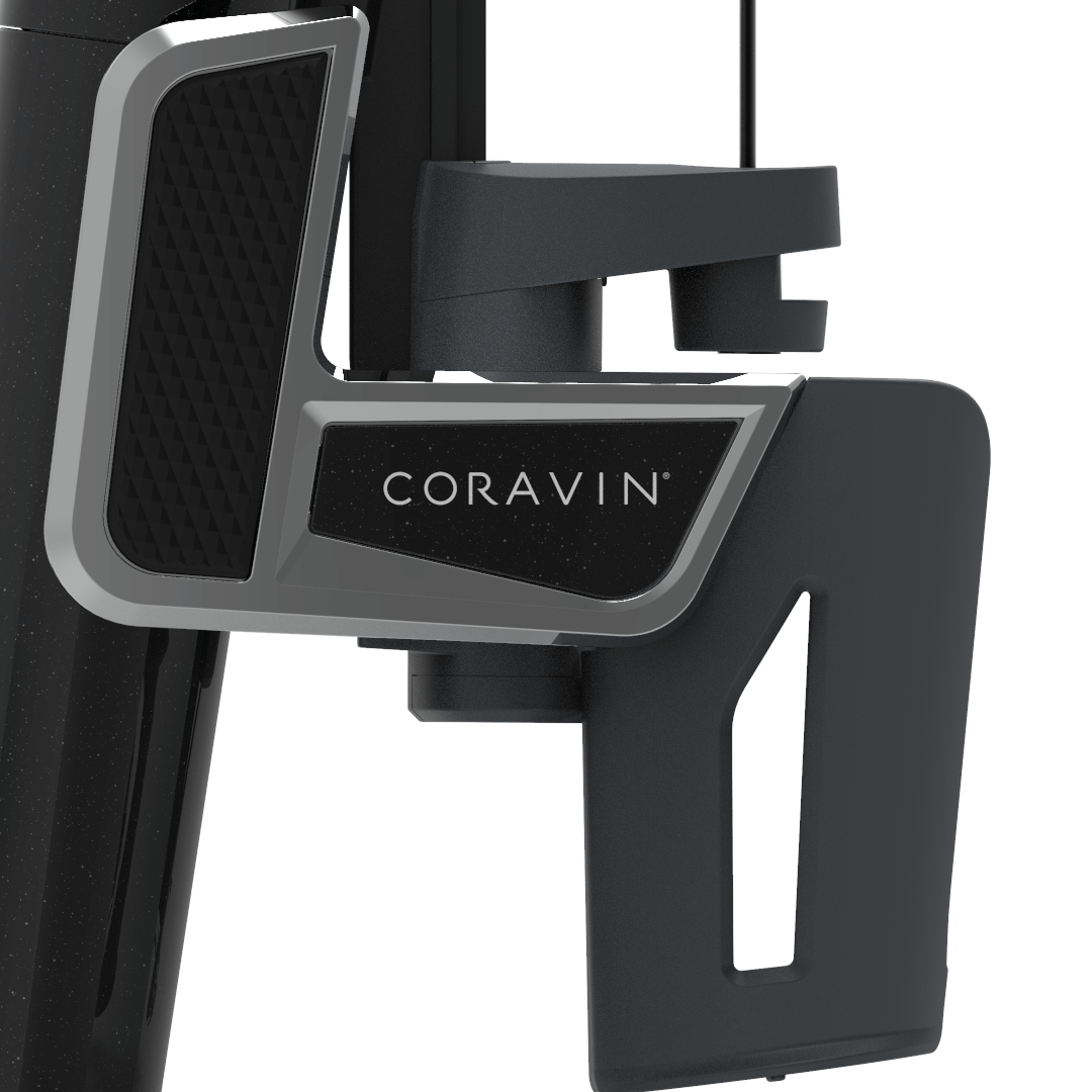
Im. 02, model_two_clamp
The final paint was going to have a thick clear coat layer with “speckles” of a glitter throughout. Accurately rendering the glitter was achieved by using a masking layer of a metallic material in the Keyshot node setup, which can be seen on the body and logo plate
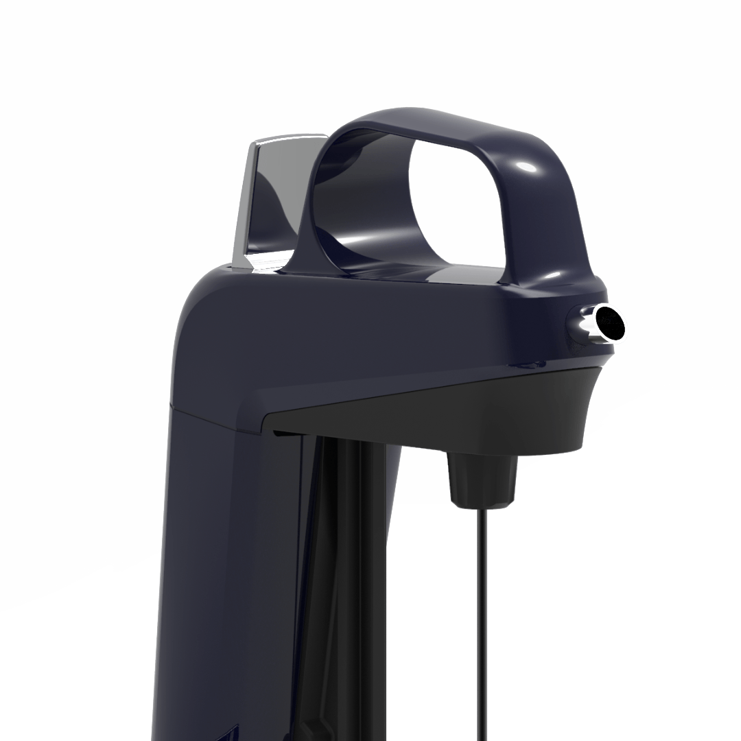
Im. 03, navy_spout
To simulate the glossy finish, a custom environment was created in Keyshot to capture the highlights. Metallic materials were used on the spout and trigger and a matte plastic for the underside of the body.
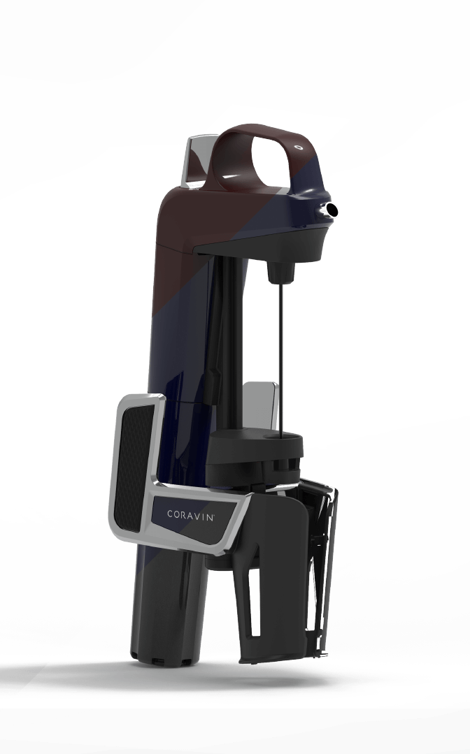
Im. 04, multi_color_setup
Since everything was created in software, exporting multiple color schemes with the same camera orientation was easy. A dark red, navy, and gray were all colors considered but weren’t used in consumer studies.
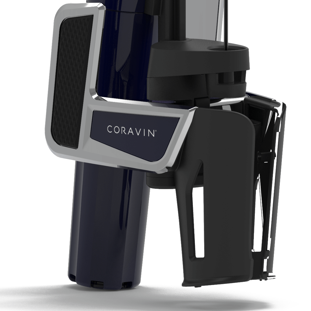
Im. 05, navy_clamp
A detailed shot of the clamp on the navy body. The diamond texture hand pad was assigned in Keyshot and the roughness of the clamp was fine-tuned in software too.
